
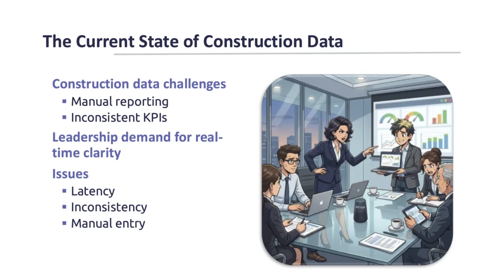
If you’ve ever sat in a meeting where three people brought three different reports and none of the numbers matched, you’re not alone.
It’s one of the first things we hear when we start working with a new client.
“How fast can you show the profit on your jobs? Is that a manual process that requires generating reports and consolidating them across multiple companies?”
Fraser Gallop at Computer Guidance Corporation’s Customer Focus 2026
It Isn’t a Dashboard Problem
The finance team has one set of numbers. Operations has another. Project managers have their own spreadsheet. Someone exports data from the ERP, someone else pulls a report from Procore, and before long the meeting has shifted away from making decisions and toward figuring out which report everyone should trust.
The interesting part is that this usually isn’t a dashboard problem.
It’s rarely because Power BI, Tableau, or your legacy reporting tool isn’t capable. More often, the dashboard is simply exposing issues that have been there all along. The data lives in multiple systems, each department has developed its own process over the years, and nobody has stopped to ask how all of those pieces fit together.
Think about a simple question like, “What’s the current profit on this job?”
It sounds straightforward, but where does that answer actually come from?
The ERP has job costs. Payroll may be running in a separate system. Approved change orders could be tracked somewhere else. Your project managers may have information sitting in spreadsheets or field applications. Even if every one of those systems is accurate, they’re answering different parts of the question.
Great Dashboards Start With Great Data
I’ve found that’s where many reporting projects go off track. The first instinct is to build a better dashboard because that’s the part everyone sees. In reality, dashboards are the last step in the process. If the data underneath isn’t consistent, timely, and trusted, no amount of visualization is going to solve the problem.
These were some of the ideas I shared during my presentation at Computer Guidance Corporation’s Customer Focus 2026. The session was split into two topics: building a modern data environment and building KPI dashboards leaders actually use. On the agenda they looked like separate presentations, but after spending more than 25 years working with construction companies, I don’t really see them that way.
The organizations that get the most value from analytics almost always have one thing in common. Before they invest heavily in dashboards, they’ve spent the time building a solid foundation for their data.
The Problem Usually Isn’t a Lack of Data
Why Reporting Breaks Down
One of the first exercises we go through with a new client is surprisingly simple. We draw a picture of where their data lives.
Most people start with the ERP and that’s usually the right place to begin. Once the conversation gets going, the list grows pretty quickly.
Payroll might be running in another application. Estimating has its own software. Field teams have mobile apps. Safety information lives somewhere else. CRM data sits in another system. Equipment may have its own database. Then there are all the Excel workbooks that have quietly become part of someone’s monthly process because they solved a problem five years ago and nobody ever replaced them.
None of that is unusual. In fact, I would say it’s typical of a successful construction company that’s grown over time.
The challenge isn’t that you are using multiple systems. Most of them are very good at what they were designed to do. The challenge is that your leadership team isn’t making decisions one application at a time. They want a complete picture of the business.
Multiple Systems, Multiple Versions of the Truth
One of the examples I shared during the presentation was change orders. If your project teams are managing change orders in Procore, is that the same number that’s in your ERP? Has it been synchronized yet? Is there any manual re-entry involved? Or are people unknowingly looking at two different versions of the truth? Those are the kinds of questions that have a much bigger impact on reporting than which visualization tool you choose.
We have also seen large organizations where producing a single invoice requires entering the same information multiple times, in multiple systems. One customer was copying information from Excel into another system, then copying it again before the invoice could finally be generated in the ERP. Nobody designed that process on purpose. It evolved over time because each individual step solved an immediate problem. The downside is that every manual handoff introduces delays, duplicate work, and opportunities for mistakes.
When you look at the business this way, the reporting challenges start to make a lot more sense. They’re rarely caused by one bad system. They’re the result of lots of good systems that were never intended to work together.
That’s why we spend much more time talking about data than dashboards at the beginning of a project. Before we can help executives answer better questions, we need to understand where those answers are actually coming from.
The next part of the process is building trust. Key elements of this are communication, documentation, and validation. If people don’t believe the numbers, they’ll stop using the dashboard no matter how well it’s designed.
Building a Modern Data Environment
Creating a Single Source of Truth
When people hear the term modern data environment, they sometimes assume we’re talking about replacing their ERP or embarking on a massive IT project. That’s usually not the case.
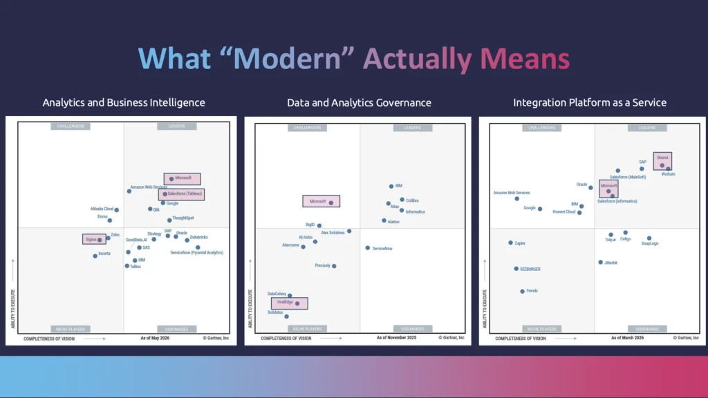
Most construction companies have already invested significantly in the systems they use every day, and for the most part, those systems do exactly what they’re supposed to do. Your ERP manages accounting and job costs. Payroll handles payroll. Project management software keeps projects moving. CRM manages sales opportunities. There’s value in each of those applications.
The challenge is that none of them were designed to answer executive questions on their own.
What we have found is that organizations get much better results when they stop thinking about reporting as something each application should handle independently.
Instead, they create a layer between their operational systems and their reporting tools. That’s where data can be brought together, standardized, validated, and prepared before anyone starts building dashboards. Think about customer revenue reported in the ERP and opportunities in the CRM. How are the customer records related? Is it a 1:1 relationship, or does a single parent customer have multiple billing records in the ERP.
In many cases, it’s a data warehouse that helps make that connection. Sometimes it’s middleware that moves and transforms information between systems. The technology itself isn’t really the important part. The goal is to create one trusted source of information that everyone can work from.
One of the diagrams I shared during the presentation illustrates this idea. Across the bottom are all the systems construction companies rely on every day, things like ERP, project management, CRM, estimating, payroll, and equipment management. Above that is a layer responsible for bringing those systems together, cleaning the data, applying business rules, and making sure everyone is working from the same definitions:
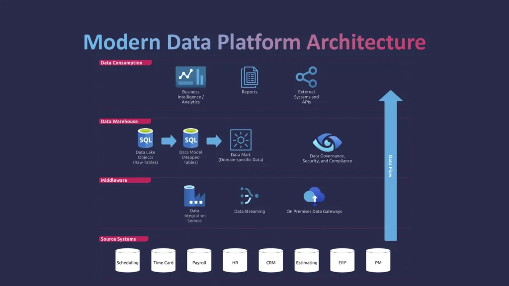
Once that work is done, reporting tools like Tableau, Power BI, Excel, or even AI applications are all drawing from the same trusted foundation instead of connecting directly to half a dozen different systems.
Separating Operations from Reporting
That’s an important shift because it separates operational systems from reporting. Your ERP doesn’t need to become a reporting platform, and your reporting platform doesn’t need to understand every nuance of your ERP. Each tool can focus on what it does best.
One of the benefits we see is that it also makes future projects much easier. If your company decides to introduce a new field application or replace its CRM, you’re not rebuilding every dashboard from scratch. You’re simply adding another source to the data environment. The reporting layer remains consistent because it’s built on standardized data rather than individual applications.
As a bonus, if you do end up switching systems, you already have a copy of your historical data. This makes the process smoother, and can also aid in setting up the new system.
Governance Matters More Than Technology
That’s also why governance becomes so important. Agreeing on what constitutes revenue, how change orders are handled, or which cost codes roll into a particular KPI may not be the most exciting part of an analytics project, but those decisions are what give executives confidence in the numbers they’re looking at.
Once those definitions are established, everyone throughout the organization is measuring performance the same way.
“Everybody’s using that same trusted data source instead of five different reports pulling from five different places.”
Fraser Gallop at Computer Guidance Corporation’s Customer Focus 2026
When that foundation is in place, something interesting happens. Meetings become less about validating reports and more about discussing what the business is actually telling you. That’s when analytics starts creating real value, because people can spend their time making decisions instead of hunting down or questioning the data.
Why AI Makes Good Data Even More Important
AI Needs Context, Not Just Data
For the past couple of years, almost every conversation about analytics has eventually turned to AI.
People want to know how it fits into their business, whether it can build dashboards, write reports, or answer questions about their data. Those are all exciting possibilities, but I think there’s an important point that often gets overlooked.
AI is only as good as the data you give it.
If you point an AI model directly at raw database tables full of abbreviations, inconsistent naming, duplicate records, and test companies, it’s going to struggle. It doesn’t understand that JC_ACT_AMT means actual job cost, or that one table contains historical information while another contains forecasts. It can only work with the information it’s given.
That’s one of the reasons we’ve been spending more time talking about semantic layers and preparing data for AI. Before AI can answer business questions intelligently, it needs data that’s organized in a way that actually reflects how your business works.
That doesn’t necessarily mean adding more data. In many cases, it means cleaning up what you already have.
Removing old or test companies. Standardizing field names. Combining related information into meaningful datasets. Defining calculations consistently. Giving the data enough context that both people and AI can understand it.
Those are the same activities that improve reporting today. AI simply makes them even more valuable.
What Golden Analytics Demonstrated
During the presentation I demonstrated one of the newer analytics platforms we’re experimenting with called Golden Analytics. What caught my attention wasn’t that it could generate charts—that’s becoming common across many products. What impressed me was how quickly it could understand a construction dataset and begin asking useful questions about it.
Instead of starting with a blank dashboard, the software examined some job cost data with forecasts and immediately identified what kind of data it contained. It suggested questions worth investigating, highlighted potential insights, and even recommended visualizations before I asked it to create anything.
From there, I wasn’t writing calculations or dragging fields onto a canvas. I was simply having a conversation.
I could tell the AI that cost type “1” represented labour, “2” represented equipment, or ask it to combine cost codes with their descriptions. It created the calculations for me, without having to know the correct syntax or learn a new language (think M, DAX, etc.). I asked it to generate a current budget field by combining the original budget with approved change orders, and it built that calculation as well. Later, when I described the dashboard I wanted in plain English it produced a working first draft in seconds.

Analysts Aren’t Being Replaced
Does that mean analysts disappear? I don’t think so.
Someone still needs to understand the requirements, validate the numbers, help define KPIs, and make sure the results are answering business questions. What AI changes is how much time people spend doing repetitive technical work.
Instead of manually creating calculated fields, adjusting layouts, and writing formulas, analysts can focus on asking better questions, testing ideas, and helping the business make better decisions.
That’s why I see AI as another reason to invest in a modern data foundation. The organizations that have already cleaned, standardized, and governed their data will be in a much stronger position to take advantage of these new tools than those trying to point AI at disconnected systems and hoping for the best.
Building KPI Dashboards Leaders Actually Use
“Once you have reliable data, you can build dashboards that leaders trust—and make better decisions faster, without waiting for the month to close.”
Fraser Gallop at Computer Guidance Corporation’s Customer Focus 2026
Start with the Business, Not the Visuals
One of the biggest misconceptions about dashboards is that success is measured by how much data you can fit onto a screen.
In our experience, successful dashboards have very little to do with visual complexity. They’re successful because they answer the right questions, present information consistently, and become part of how leadership actually runs the business.
A project we started in 2022 illustrates that well.
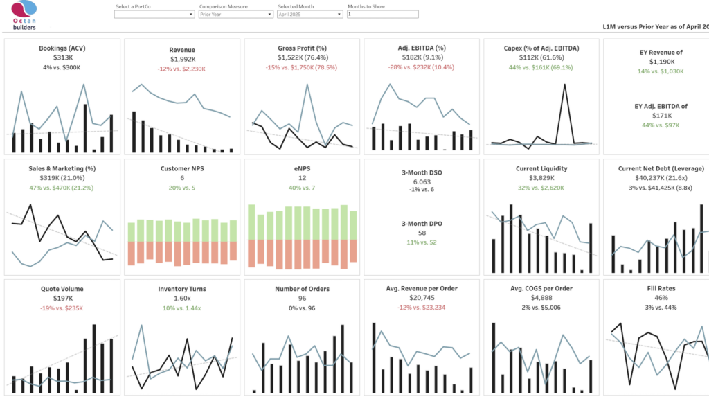
The client was a private equity firm with several companies in its portfolio. Their challenge wasn’t a lack of reporting. Each company already had reports. The problem was that every business reported differently, making it difficult for leadership to compare performance across the portfolio.
Their goal was simple: create a single KPI dashboard that presented every company using the same metrics, the same calculations, and the same definitions.
One advantage on this project was that the executives already knew what they wanted to measure. Because acquiring and operating businesses was their core business, they had spent years refining the KPIs that mattered most. We weren’t starting with a blank sheet of paper trying to decide what should be on the dashboard. Instead, the work focused on making those metrics available consistently across every company.
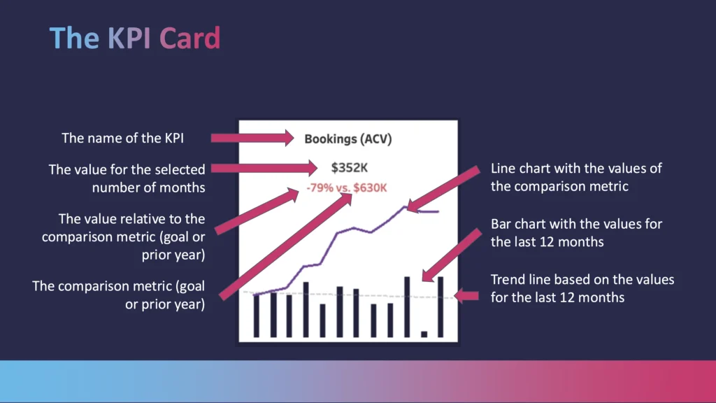
That doesn’t happen on every project. Many organizations need a discovery process before building anything. Different departments often have different ideas about how a KPI should be calculated, or even whether it belongs on an executive dashboard at all. Taking the time to build alignment early almost always pays dividends later.
Design for Executives
One lesson we’ve learned repeatedly is that executives don’t necessarily want more interactivity.
As dashboard developers, it’s tempting to add filters, drill-downs, hover actions, and dozens of ways to explore the data. Technically, those features are impressive. In practice, many executives simply want to open the dashboard and immediately see the information they’re responsible for.
During one recent project we suggested using a company selector so leaders could switch between businesses from a drop-down list. The response surprised us.
“We don’t want that. Just give us four tabs.“
It was a good reminder that dashboards should be designed around the people using them, not around the capabilities of the software. Sometimes the simplest experience is the best one.
That doesn’t mean interactivity has no place. While executives may not want to click through multiple filters during a meeting, controllers and analysts still need to understand where every KPI comes from. That’s why drill-down capability remains essential. When someone asks why revenue changed or why accounts receivable increased, the supporting detail needs to be only a click away.
The goal isn’t to eliminate complexity. It’s to keep complexity behind the scenes until someone actually needs it.
Dashboards Should Evolve Over Time
Perhaps the biggest lesson from this project, though, is that dashboards are never really finished.
The first version solved the original problem, but using it consistently created new ideas. After reviewing the dashboard quarter after quarter, the executive team realized some KPIs weren’t providing much value while others had become much more important. Rather than treating the dashboard as a completed project, we treated it as an evolving management tool and updated it to reflect how the business had changed.
That’s exactly what you want to see.
If your dashboards are driving conversations, people will naturally begin asking better questions. The dashboard evolves because the organization is becoming more data-driven, not because the original implementation failed. That’s a sign the reporting is doing its job.
Start Small, Then Scale
Focus on One Business Problem
One of the most common questions we hear is, “Where do we start?”
The answer is almost never, “Build a massive enterprise data warehouse.”
In fact, that’s one of the biggest pitfalls.
It’s tempting to try to solve every reporting challenge in one project, bringing together every table from every system before delivering anything to the business. In reality, those projects often take too long to deliver value.
A better approach is to start with a business problem that matters.
Maybe it’s improving project profitability reporting. Maybe it’s giving executives a trusted financial dashboard. Maybe it’s bringing together labour data that currently lives in multiple systems. Solve one meaningful problem well, establish the foundation, and then build from there.
As I mentioned during the presentation: “Start small and scale.”
“You don’t need to spend a year building the entire data warehouse. Start small, answer the business questions that deliver value today, and build from there.”
Fraser Gallop at Computer Guidance Corporation’s Customer Focus 2026
Build a Foundation for What’s Next
Every successful analytics environment we’ve built has grown incrementally. Each new dashboard, integration, or data source builds on the work that came before it. That approach delivers value sooner while creating a flexible foundation that can evolve alongside the business.
The same foundation that supports trusted dashboards today will also support tomorrow’s AI initiatives, automated reporting, and future integrations. Those capabilities don’t require starting over—they become the natural next step.
Final Thoughts
Construction companies generate more data than ever before. From labor and equipment time cards to safety reports to job cost transactions, the volume of data is always increasing. Data alone doesn’t improve decision-making.
The organizations seeing the greatest return from analytics aren’t necessarily collecting more information. They’re doing a better job of bringing it together, establishing a trusted source of truth, and delivering insights in a way that’s easy for leaders to consume.
When that foundation is in place, dashboards become faster to build, easier to trust, and far more valuable. AI becomes practical rather than experimental. Most importantly, leadership can spend less time debating numbers and more time acting on them.
At Onware, we’ve spent more than two decades helping construction companies work with their data, streamline reporting, and build analytics platforms that support better decisions. As both construction technology specialists and business intelligence consultants, we’ve seen firsthand that the most successful dashboard projects don’t begin with visualization software—they begin with understanding the data behind it.
If you’re looking to modernize your reporting environment or explore how AI and analytics can support your business, we’d be happy to start the conversation.
About Fraser Gallop
Fraser Gallop is the CEO of Onware and a Tableau Ambassador with more than 20 years of experience in software, business intelligence, and analytics. He helps construction and industrial organizations turn complex data into practical insights that support faster, more confident decisions.
Additional Resources
To learn more about the companies and technologies discussed in this presentation:
- Computer Guidance Corporation (CGC): eCMS Enterprise ERP software for construction companies: https://www.computerguidance.com
- Onware: Business intelligence, dashboards, and reporting solutions for construction: https://www.onware.com
- Golden Analytics: AI-powered analytics platform featured during the demonstration: https://goldenanalytics.com/