
When comparing Excel vs Power BI vs Tableau, the goal is simple: understand the differences and decide which analytics tool best fits your organization. From daily operations to long-term planning, teams rely on these three platforms to analyze data, build dashboards, and generate insights. While they all support analytics, the way they handle reporting, scalability, and visualization varies significantly.
Data is at the heart of how organizations make decisions today. From daily operations to long‑term planning, analytics helps teams understand what’s happening and what to do next. To make sense of that data, most businesses rely on three major tools: Microsoft Excel, Microsoft Power BI, and Tableau.
All three tools help teams work with numbers, but they do so in very different ways:
- Excel remains the flexible, familiar workhorse
- Power BI provides scalable business intelligence within the Microsoft ecosystem
- Tableau excels at turning data into clear, compelling visual stories.
The right choice depends on your goals, how your people work, and the level of insight you need day to day.
Excel: The Reliable Everyday Essential
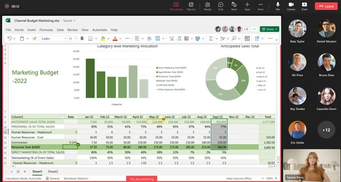
Most people’s analytics journey begins with Microsoft Excel because it’s familiar, flexible, and easy-to-use. Its grid-based structure encourages experimentation, and its simplicity allows users to test ideas quickly without learning a new interface or specialized training.
For decades, Excel has served as the universal starting point for data work across industries. Its flexibility allows users to build models, manage budgets, perform scenario planning, and handle detailed calculations with full control. Its flexibility allows users to build models, perform ad-hoc analysis, and visualize data without specialized training.
Its longevity and accessibility have made Excel the first tool many teams turn to when working with data. Analysts often rely on it to explore datasets, test assumptions, and build early prototypes before moving into specialized analytics tools.
Beyond these, Excel can also act as a gateway to enterprise data. Without modifying or rewriting the underlying database data, users can create and edit connections to external sources such as SQL Server, Azure services, Microsoft Fabric, Power BI datasets, and other databases. This ensures security while enabling real-time analysis.
Power Query is a data transformation and data preparation engine built into Excel and Power BI. It allows teams to clean, shape, and combine data into structured tables before analysis, making complex transformations accessible without coding.
Recently, Microsoft has introduced meaningful improvements that keep Excel relevant in an increasingly data-driven world.
One of the most notable additions is Python in Excel, which integrates the power of Python’s statistical and machine-learning libraries directly into the workbook. Analysts can now run regressions, clustering, forecasting, and complex visualizations without switching applications or exporting data.
Another enhancement, Excel Live in Teams, has changed how organizations collaborate on spreadsheets. Instead of emailing versions back and forth, colleagues can now co-edit the same workbook during an online meeting. Decisions that once required long threads of messages can now be made in minutes.
Meanwhile, connected data types give Excel a more structured relationship with Power BI datasets and Microsoft Fabric, allowing teams to pull controlled, up-to-date data into spreadsheets without worrying about version mismatches. Allowing users to refresh dashboards or push models directly from their workbook.
While Excel remains indispensable, its limitations become more evident as organizations scale. Complex spreadsheets can become challenging to maintain. Inconsistencies arise when multiple teams store their own versions, and visualizations often lack interactivity. These are the moments when organizations start exploring dedicated analytics platforms.
Why it matters for your business:
• Perfect for quick calculations and what-if scenarios
• Live collaboration during meetings
• A natural starting point for teams before moving to dashboards
Power BI: Easy to Start, Scalable When You Grow
The key difference between Excel and Power BI comes down to structure and scale.
Excel supports flexible, ad hoc analysis, while Power BI is designed for automated dashboards, centralized data models, and organization-wide reporting.
For teams already operating within the Microsoft ecosystem, Power BI integrates seamlessly with tools like Teams, SharePoint, and Dynamics, making it a natural extension of existing workflows.
In today’s analytics landscape, Power BI has become one of the most widely adopted business intelligence platforms because it balances accessibility with enterprise-scale capabilities. It allows users to connect to hundreds of data sources, clean and transform data using Power Query, and create interactive dashboards that update automatically. These features make Power BI especially valuable in environments where data flows continuously from operational systems and needs to be consolidated for daily decision-making.
While its drag-and-drop interface makes dashboard creation approachable, both beginners and advanced users should become familiar with DAX (Data Analysis Expressions) and M language in Power Query. DAX is essential for creating calculated measures and columns, while M enables advanced data shaping and transformations. Even a basic understanding of these languages helps users build custom dashboards and unlock deeper insights.
One of Power BI’s greatest strengths is its integration with Microsoft Fabric, the company’s unified analytics platform. Fabric brings data engineering, real‑time analytics, data science, and BI together, allowing teams to work in a shared analytical environment rather than separate tools. This unified ecosystem reduces duplicate work and improves alignment between data teams and business stakeholders.
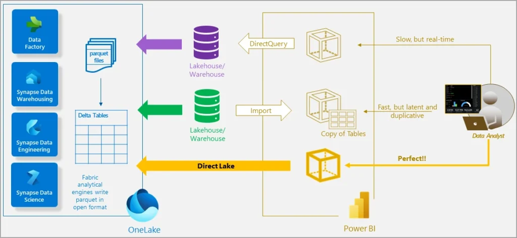
Fabric’s OneLake gives organizations a centralized storage layer that acts as a single, governed source. Instead of working from separated spreadsheets or siloed databases, teams can rely on consistent, trusted datasets across the entire organization.
Performance has also improved significantly in recent releases. The introduction of Direct Lake enables dashboards to query massive datasets directly from Fabric without requiring full refreshes. This allows end users to experience faster data loading, more accurate insights, and near‑real‑time updates even when working with millions of rows.
Power BI also lowers the barrier for new users through Copilot, Microsoft’s built-in AI assistant. Copilot can assist in generating visualizations, building report pages, and even writing DAX formulas using natural language. This reduces the learning curve and helps teams turn raw data into structured dashboards without specialized technical skills.
Overall, Power BI is an excellent choice for organizations that value automation, strong data governance, and deep Microsoft integration. Its dashboards are efficient and scalable, though its visual design and storytelling capabilities are more functional than expressive.
Why it matters for your business:
• Quick wins for teams already in Microsoft environments
• AI assistance with Copilot for faster dashboard creation
• Performance at scale for big data and complex reporting
Tableau: Advanced Visual Analytics for Decision Makers
When evaluating Power BI vs Tableau, Tableau stands out for its advanced visualization capabilities and flexible dashboard design. It emphasizes visual exploration and storytelling, making it a strong option for teams that prioritize presentation and interactive analysis.
Tableau is known for transforming raw data into clear, intuitive, and visually compelling stories. Since its launch in the early 2000s, it has stood out in the analytics industry for making complex data analysis approachable through visualization rather than formulas. This foundation helped Tableau become a favourite among analysts, executives, and business users who prefer insight-driven exploration over technical modeling.
Unlike traditional business intelligence tools that rely heavily on predefined reports, Tableau introduced a new approach: letting users explore data freely through visual interactions. Its drag‑and‑drop interface, paired with a fast in‑memory engine, created a more creative analytical experience where patterns can be spotted quickly and questions evolve naturally. This visual-first methodology made Tableau a leader in self‑service analytics.
Calculated fields in Tableau use a syntax similar to Excel formulas, making the transition easier for experienced spreadsheet users. Functions like IF, DATEPART, and SUM feel familiar, reducing the learning curve significantly for beginners.
Tableau focuses on visual clarity and exploration. It helps analysts and leaders see cause and effect. Dashboards are highly interactive and can be tailored to your business’s view of performance.
Tableau’s design philosophy focuses on helping users see relationships in data rather than presenting static charts. The platform encourages exploration: users drag and drop fields, adjust filters interactively, and drill into patterns without needing to understand formulas or code. It’s this emphasis on visual reasoning that makes Tableau particularly appealing to executives, managers, and non-technical stakeholders.
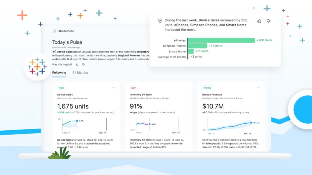
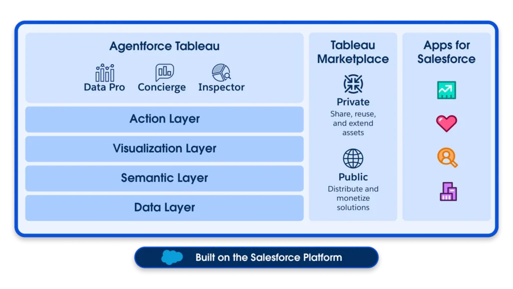
Tableau’s recent innovations strengthen this user-friendly direction. Tableau Pulse, for instance, delivers personalized insights in natural language, highlighting trends and changes relevant to each user. Instead of navigating through dashboards, leaders receive targeted insights in a simple, conversational format, even on mobile devices.
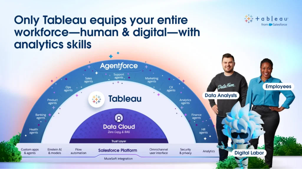
Another major advancement is Agentforce, an AI assistant that guides users through their data. Agentforce focuses on helping people understand what the data means. It can suggest relevant comparisons, highlight anomalies, and provide contextual explanations. This makes it easier for non-analysts to interpret complex metrics, enabling the creation of necessary calculated fields for visuals.
Recently, Tableau also released advanced customization through Viz Extensions. This new feature allows developers to design unique visual components or embed industry-specific KPIs. This flexibility means your dashboards can look and behave exactly how your team needs.
Combined with Tableau Accelerators, prebuilt dashboards for finance, operations, HR, supply chain, sustainability, and more, the platform helps organizations launch fast while retaining the flexibility to tailor dashboards over time.
Additionally, Tableau Next built on the Salesforce platform. It offers secure, governed access to both company and Salesforce data. This integration creates a unified environment where users can build dashboards, generate actionable insights, and leverage AI-driven recommendations without leaving the Salesforce ecosystem.
For organizations already using Salesforce, this means faster decision-making, reduced data silos, and improved alignment between analytics and customer engagement strategies. Sales, marketing, and leadership teams benefit most, as they can combine CRM data with operational metrics to drive performance and strategic planning. All within a trusted, enterprise-grade security framework!
For businesses that want data to tell a clear, visually compelling story, Tableau remains the strongest choice. Its dashboards feel more polished and intuitive, and its AI tools focus on insight and production, making it a preferred platform for leadership-facing and business-tailored reporting. Definitely the best choice if you want advanced dashboard reporting for your data!
Why it matters for your business:
• Executives get instant insights without digging through reports
• Analysts can build highly customized dashboards for unique KPIs
• Non-technical users receive AI-driven suggestions to guide decisions
Comparison Table: Which Tool Fits Which Scenario?
| Scenario | Excel | Power BI | Tableau |
| Financial modeling & budgeting | ✓✓ | ✓ | ✓ |
| Quick dashboard building | ✓✓ | ✓ | |
| Fast dashboards on large datasets | ✓✓ (Direct Lake) | ✓ | |
| Advanced customization | ✓ | ✓✓ | |
| Data preparation & flexibility | ✓ | ✓✓ (Power Query & DAX) | ✓✓ (Tableau Prep) |
| Collaboration & accessibility | ✓✓ (Excel Live) | ✓✓ (Teams & SharePoint) | ✓ |
| Data governance & scalability | ✓✓ (Fabric + OneLake) | ✓ | |
| AI assistance for building reports | ✓ (Copilot) | ✓ ✓ (Pulse + Agentforce) | |
| Visualization & storytelling | ✓ | ✓✓ | |
| Executive insights & mobile experience | ✓ | ✓✓ | |
| Microsoft 365 ecosystem fit | ✓✓ | ✓✓ | ✓ |
Need Help Deciding?
Choosing between Excel vs Power BI vs Tableau depends on how you work with data, how much automation you need, and how important visualization is to your team. The right decision comes down to scale, governance, reporting complexity and your unique business goals—not just the features—and successful adoption depends on governance, integration, and user training.
If you’re deciding between Excel, Power BI, and Tableau, clarity matters more than features. We help organizations evaluate their reporting needs, data maturity, and internal workflows to determine the right path forward.
Talk with our team to build a practical analytics strategy that fits how your business actually works